Reflection
This project reinforced my belief that clarity and accessibility drive conversion. By transforming static comparison tables into an interactive, responsive, and human-centered experience, I helped CIBC empower customers to make confident choices, seamlessly transitioning from exploration to action.
Client: CIBC (Canadian Imperial Bank of Commerce)
Role: User Experience Lead
Project Overview
CIBC wanted to modernize its online Bank Account Comparison and Account Opening experiences to help customers make confident financial decisions.
The legacy comparison tool was static and text-heavy, making it difficult for customers to evaluate features across accounts or understand which product best fit their needs. Many users abandoned the process before completing an application, especially on mobile devices.
The goal was to design an intuitive, responsive, and accessible comparison experience that would increase engagement, reduce decision friction, and streamline conversion into the account-opening flow.
The Challenge
CIBC’s existing account pages and comparison tables were:
- Non-responsive, difficult to navigate on smaller screens.
- Overloaded with jargon and fine print, creating confusion.
- Inconsistent with CIBC’s evolving design system and accessibility standards.
- Lacking in interactive decision support, leaving users to self-interpret features and fees.
The project needed to balance marketing clarity, regulatory disclosure, and usability, all within a cohesive, mobile-first digital experience.
My Role & Contributions
As the Lead UX Designer, I directed the entire redesign process from discovery to delivery, integrating research, design, and accessibility best practices.
- Discovery & Research
- Conducted user research sessions and heuristic audits to understand decision-making pain points.
- Partnered with business stakeholders to prioritize core differentiators among accounts.
- Analyzed analytics and heatmaps to identify where users dropped off during comparison or application.
- Journey Mapping & Experience Strategy
- Created customer journey maps and service blueprints outlining the decision flow from research → comparison → application → onboarding.
- Identified opportunities to support both first-time banking customers and existing clients exploring upgrades.
- Interaction Design & Prototyping
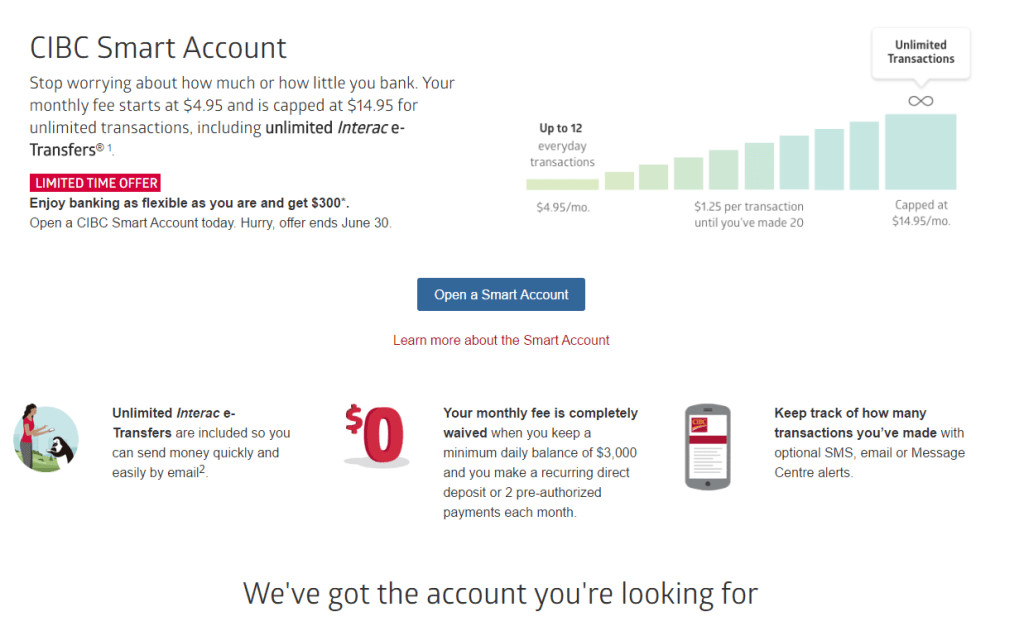
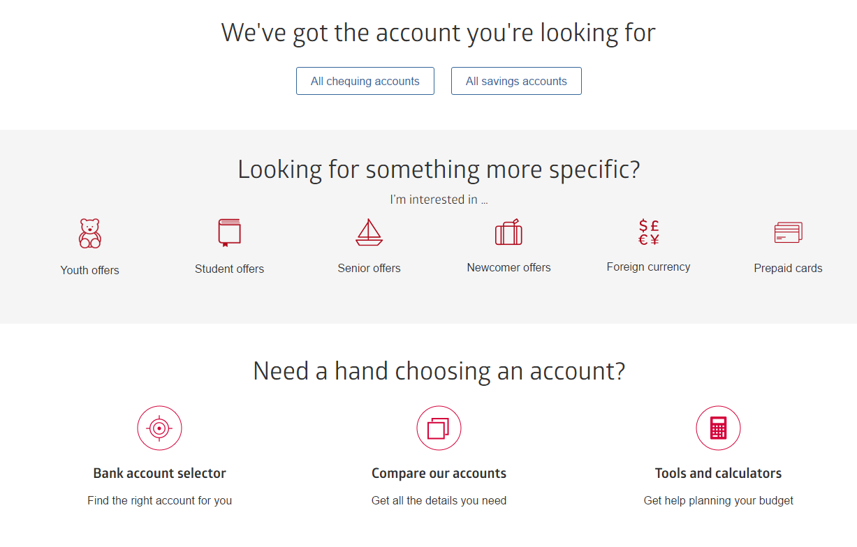
- Designed responsive, interactive comparison tables allowing customers to view features side-by-side and filter by needs (e.g., student, travel, savings).
- Simplified complex financial terms through plain-language content and expandable “Learn More” modules for transparency without clutter.
- Built high-fidelity prototypes in Figma and Axure for stakeholder review and usability testing.
- Usability & Accessibility Testing
- Conducted remote usability tests on desktop and mobile to validate clarity, scanability, and comprehension.
- Applied WCAG 2.1 AA standards, improving keyboard navigation, color contrast, and ARIA labeling for comparison tables.
- Collaboration & Delivery
- Worked closely with product owners, marketing, and developers to integrate the new design into CIBC’s digital design system.
- Provided annotated design specifications and collaborated on QA testing to ensure accessible implementation.
Outcomes & Impact
- Reduced account selection time by 35% as users could easily compare key features.
- Increased conversion into the account opening flow by over 20% following redesign launch.
- Improved accessibility compliance and mobile usability, achieving full WCAG 2.1 AA certification.
- Set a new pattern for comparison experiences later extended to credit cards and savings products.
