Context
TD Insurance wanted to modernize its online quoter to improve conversion, reduce customer confusion, and meet regulatory accessibility obligations (AODA/WCAG). The tool serves thousands of travelers purchasing insurance online or via mobile.
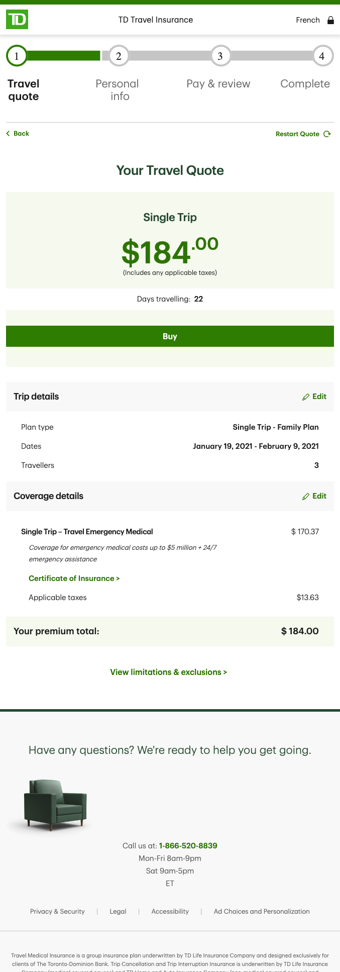
Challenge
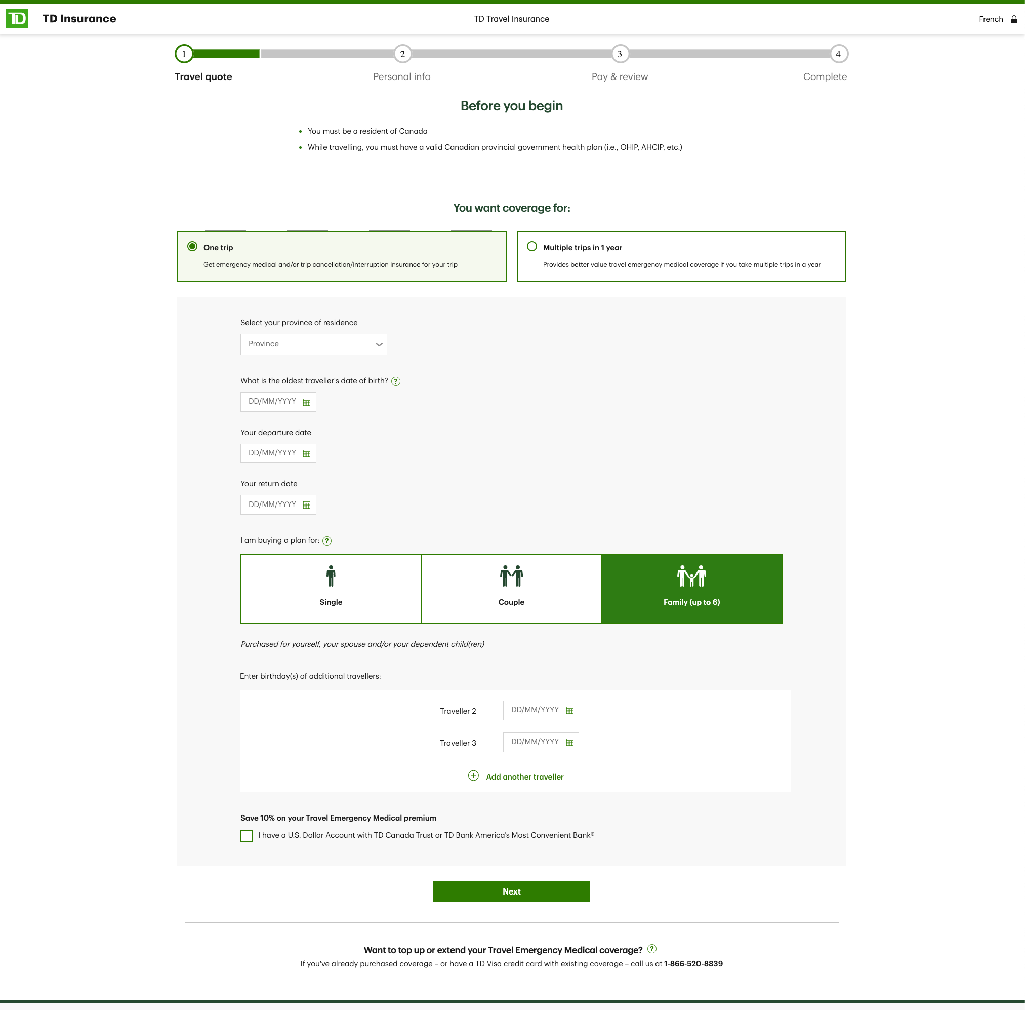
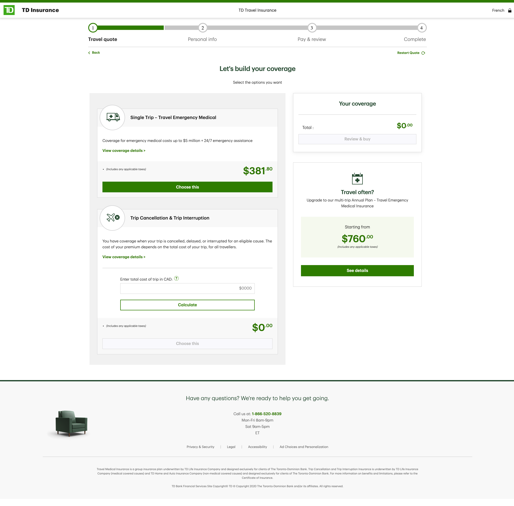
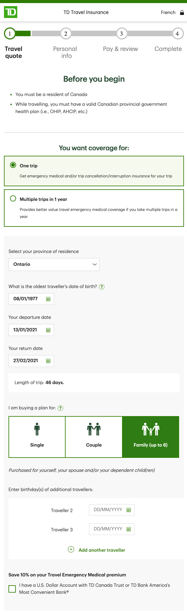
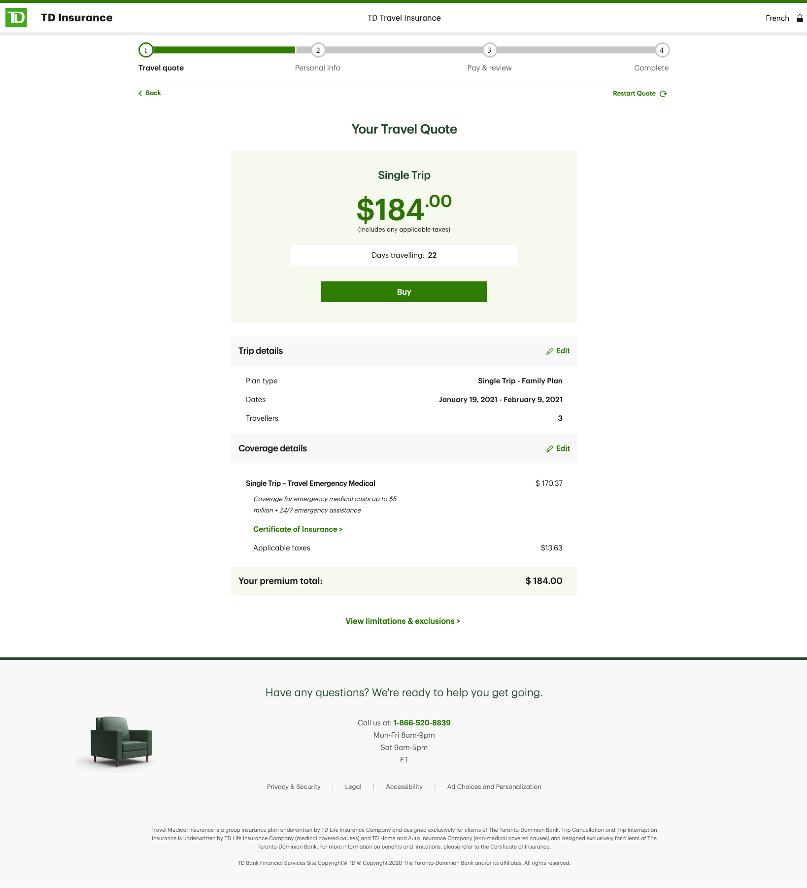
The legacy interface was cluttered and text-heavy; users abandoned mid-quote due to unclear steps, jargon, and inconsistent error handling. The product also lacked cohesive design system integration and accessibility consistency.
Process & Approach
As Lead UX Designer within Havas Canada’s TD Digital Team, I delivered end-to-end design:
- Discovery & Research – Conducted competitive benchmarking, heuristic evaluation, and customer interviews; mapped the current-state journey exposing friction in quote creation and comprehension.
- Co-Design & Ideation – Facilitated accessibility-inclusive workshops with stakeholders from risk, compliance, and marketing to balance legal content with usability.
- Information Architecture & Blueprinting – Produced service blueprints illustrating data handoffs between systems and customer touchpoints.
- Prototyping & Validation – Designed high-fidelity, responsive prototypes in Figma/Sketch; executed moderated usability testing with assistive-tech users.
- Content Strategy – Authored plain-language UX microcopy, simplifying insurance terminology while maintaining compliance.
- Design System Expansion – Built accessible Figma components integrated into TD’s enterprise library; documented interaction patterns and keyboard behaviors.
Outcome
- Form-completion rate improved by 18 %; user satisfaction scores rose by 22 % post-launch.
- Achieved AODA/WCAG 2.1 AA certification across web and mobile.
- Influenced TD’s corporate accessibility playbook and training modules.
Reflection
This project reinforced my belief that accessibility and simplicity drive trust and conversion, not just compliance.