Sorry, But AI Deserves ‘Please’ Too!

As we increasingly lean on AI as a trusted ally in our professional and personal lives, we must ponder the implications of our reliance on their capacity to comprehend and craft natural language. What does this mean for our autonomy, creativity, and the very essence of human connection?

Introduction

Large language models (LLMs) and AI chatbots have become woven into the fabric of our workplaces and personal lives, inviting us to reflect on the profound shift in our interaction with technology. As we navigate this new landscape, we find ourselves reevaluating the role of artificial intelligence (AI) in our daily routines. These advancements have not merely changed how we access information, seek advice, and perform research; they have opened a door to an era where insights and solutions are unveiled with remarkable speed and efficiency. As we increasingly lean on AI as a trusted ally in our professional and personal lives, we must ponder the implications of our reliance on their capacity to comprehend and craft natural language. What does this mean for our autonomy, creativity, and the very essence of human connection?

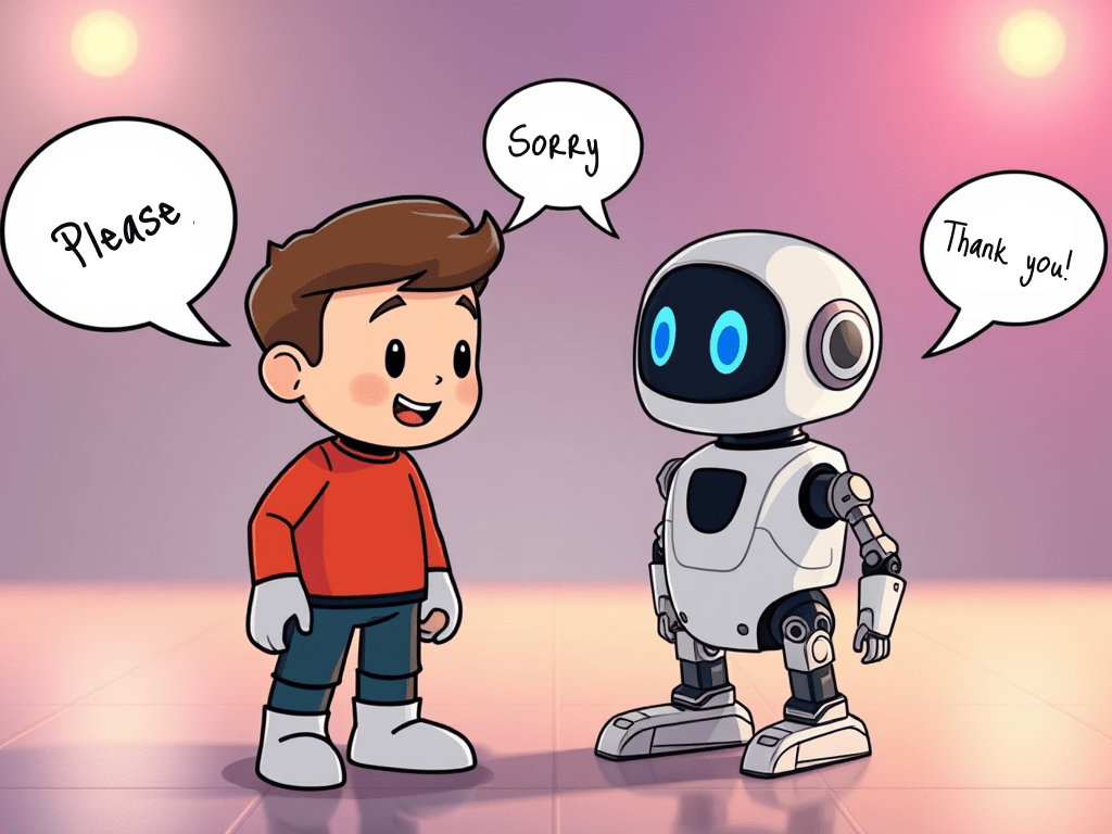
As these AI systems evolve to simulate human-like interactions, an intriguing phenomenon has emerged: people often address AI with polite phrases like “please” and “thank you,” echoing the social etiquette typically reserved for human conversations. This shift reflects a deeper societal change, where individuals begin to attribute a sense of agency and respect to machines, blurring the lines between human and artificial interaction. Furthermore, as AI continues to improve, this trend may lead to even more sophisticated relationships, encouraging users to engage with AI in ways that foster collaboration and mutual understanding, ultimately enhancing productivity and satisfaction in both personal and professional interactions.

With AI entities now entrenched in collaborative environments, one must ask: how do we, as humans, truly treat these so-called conversational agents? Despite AI’s lack of real emotions and its indifference to our so-called politeness, the patterns of user interaction reveal deep-seated beliefs about technology and the essence of human-AI relationships. LLMs are crafted to imitate human communication, creating an illusion of agency that drivers users to apply familiar social norms. In collaborative contexts, politeness becomes not just a nicety, but a catalyst for cooperation, compelling users to extend the very same respectful behavior to AI that they reserve for their human colleagues. [1]

Politeness Towards Machines and the CASA Paradigm

Politeness plays a vital role in shaping social interactions, particularly in environments where individuals must navigate complex power dynamics. It promotes harmony, reduces misunderstandings, and fosters cooperation among participants. Rather than being a rigid set of linguistic rules, politeness is a dynamic process involving the negotiation of social identities and power dynamics. These negotiations are influenced by participants’ backgrounds, their relationships with one another, and the specific context in which the interaction takes place [2].

Extending the concept of politeness to interactions with machines highlights the broader question of social engagement with technology. The Computers Are Social Actors (CASA) paradigm states that humans interact with computers in a fundamentally social manner, not because they consciously believe computers are human-like, nor due to ignorance or psychological dysfunction. Rather, this social orientation arises when people engage with computers, revealing that human-computer interactions are biased towards applying social norms similar to those used in human-to-human communication [3].

The CASA approach demonstrates that users unconsciously transfer rules and behaviours from human-to-human interactions, including politeness, to their engagements with AI. However, research examining young children’s interactions with virtual agents revealed contrasting patterns. Children often adopted a command-based style of communication with virtual agents, and this behaviour sometimes extended to their interactions with parents and educators in their personal lives [4].

Further studies into human-robot interaction have shown that the choice of wake-words can influence how users communicate with technology. For instance, using direct wake-words such as “Hey, Robot” may inadvertently encourage more abrupt or rude communication, especially among children, which could spill over into their interactions with other people. Conversely, adopting polite wake-words like “Excuse me, Robot” was found to foster more respectful and considerate exchanges with the technology [5].

Human-AI Interaction Dynamics

Research demonstrates that attributing agency to artificial intelligence is not necessarily the primary factor influencing politeness in user interactions. Instead, users who believe they are engaging with a person—regardless of whether the entity on the other end is human or computer—tend to exhibit behaviours typically associated with establishing interpersonal relationships, including politeness. Conversely, when users are aware that they are communicating with a computer, they are less likely to display such behaviours [6].

This pattern may help explain why users display politeness to large language models (LLMs) and generative AI agents. As these systems become more emotionally responsive and socially sophisticated, users increasingly attribute human-like qualities to them. This attribution encourages users to apply the same interpersonal communication mechanisms they use in interactions with other humans, thereby fostering polite exchanges.

Politeness in human-AI interactions often decreases as the interaction progresses. While users typically start out polite when engaging with AI, this politeness tends to diminish as their focus shifts to completing their tasks. Over time, users become more accustomed to interacting with AI and the complexity of their tasks may lessen, both of which contribute to a reduction in polite behaviour. For example, a user querying an LLM about a relatively low-risk scenario—such as running a snack bar—may quickly abandon polite language once the context becomes clear. In contrast, when faced with a higher-stakes task—such as understanding a legal concept—users may maintain politeness for longer, possibly due to increased cognitive demands or the seriousness of the task. In such scenarios, politeness may be perceived as facilitating better outcomes or advice, especially when uncertainty is involved.

Conclusion

Politeness in human-AI interactions is shaped by a complex interplay of social norms, individual user characteristics, and system design choices—such as the use of polite wake-words and emotionally responsive AI behaviours. While attributing agency to AI may not be the primary driver of politeness, users tend to display interpersonal behaviours like politeness when they perceive they are interacting with a person, regardless of whether the entity is human or computer.

As AI agents become more emotionally and socially sophisticated, users increasingly apply human-like communication strategies to these systems. However, politeness tends to wane as familiarity grows and task complexity diminishes, with higher-stakes scenarios sustaining polite engagement for longer. Recognizing these dynamics is crucial for designing AI systems that foster respectful and effective communication, ultimately supporting positive user experiences and outcomes.

Transforming Data into Actionable Insights through Design

Introduction

At the age of fifteen, I secured a summer position at a furniture factory. To get the job, I expressed my interest in technology and programming to the owner, specifically regarding their newly acquired CNC machine. To demonstrate my capability, I presented my academic record and was hired to support a senior operator with the machine.

That summer, I was struck by the ability to control complex machinery through programmed commands on its control board. The design and layout of the interface, as well as the tangible results yielded from my input, highlighted the intersection of technical expertise and thoughtful design. This experience sparked my curiosity about the origins and development of such systems and functionalities.

I have always maintained that design is fundamentally about clarity, how systems make sense and elicit meaningful responses. It involves translating intricate, technical concepts into experiences that are intuitive and accessible. This perspective has guided my approach throughout my career, whether developing an AI-powered dashboard for Air Canada, creating an inclusive quoting tool for TD Insurance, or designing online public services for Ontario.

The central challenge remains consistent: achieving transparency and trust in complex environments. Effective design bridges the gap between people and systems, supporting purposeful engagement.

My observational nature drives me to understand how systems operate, decisions are reached, and individuals navigate complexity. This curiosity informs my design methodology, which begins by analyzing the foundational elements, people, processes, data, and technology, that must integrate seamlessly to deliver a cohesive experience.

To me, design is not merely an aesthetic layer; it serves as the essential framework that provides structure, clarity, and empathy within multifaceted systems. Designing from this perspective, I prioritize not only usability but also alignment across stakeholders and components.

My core design strengths

Throughout my career, I have found that my most effective work comes from applying a set of foundational strengths to every project. These strengths consistently guide my approach and ensure each solution is thoughtful, impactful, and built for real-world complexity.

Systems Thinking: I make it a priority to look beyond surface-level interfaces. My approach involves examining how data, people, and technology interact and influence each other within a system. By doing so, I can design solutions that are not only visually appealing but also deeply integrated and sustainable across the entire ecosystem.

Human-Centred Design: Every design decision I make is grounded in observation and empathy. I focus on the user’s experience, prioritizing how it feels to engage with the product or service. My aim is to create solutions that resonate with individuals on a practical and emotional level.

Accessibility & Inclusion: Designing for everyone is a fundamental principle for me. I strive to ensure that the experiences I create are not just compliant with accessibility standards, but are genuinely usable and fair for all users. Inclusion is woven into the fabric of my process, shaping outcomes that reflect the diversity of people who will interact with them.

Storytelling & Visualization: I leverage visual storytelling to simplify and clarify complex ideas. Using visuals, I help teams and stakeholders see both what we are building and why it matters. This approach fosters understanding and alignment, making the design process transparent and purposeful.

Facilitation & Collaboration: I believe that the best insights and solutions emerge when diverse voices contribute to the process. By facilitating collaboration, I encourage open dialogue and collective problem-solving, ensuring that outcomes are shaped by a broad range of perspectives and expertise.

If I had to distill all these strengths into a single guiding principle, it would be this: “I design to understand, not just to create.”

My design approach: a cyclical process

Design, for me, is less of a straight line and more of a cycle, a continuous rhythm of curiosity, synthesis, and iteration. This process shapes how I approach every project, ensuring that each step builds upon the previous insights and discoveries.

1. Understand the System: I begin by mapping the entire ecosystem, considering all the people involved, their goals, the relevant data, and any constraints. This foundational understanding allows me to see how different elements interact and influence each other.

2. Observe the Experience: Next, I dedicate time to watch, listen, and learn how people actually engage with the system. Through observation and empathy, I uncover genuine behaviours and needs that may not be immediately apparent.

3. Synthesize & Prioritize: I then translate my findings into clear opportunities and actionable design principles. This synthesis helps to focus efforts on what matters most, guiding the team toward solutions that address real challenges.

4. Visualize the Future: Prototyping and iteration are central to my approach. I work to make complexity feel simple and trustworthy, refining concepts until the design communicates clarity and confidence.

5. Deliver & Educate: Finally, I collaborate with developers, stakeholders, and accessibility teams to bring the vision to life. I also focus on making the solution scalable, ensuring that the impact and understanding extend as the project grows.

Good design isn’t just creative, it’s disciplined, methodical, and deeply human.

Projects that demonstrate impact

Transforming operations at Air Canada

At Air Canada, I was responsible for designing AI dashboards that transformed predictive data into clear, actionable insights. These dashboards provided operations teams with the tools to act quickly and effectively, which resulted in a significant reduction in delay response time, by 25%. This project highlighted the value of turning complex data into meaningful information that drives real-world improvements.

Advancing accessibility at TD Insurance

During my time at TD Insurance, I led an accessibility-first redesign of the Auto and Travel Quoter. My approach was centred on ensuring that the solution met the rigorous standards of WCAG 2.1 AA compliance. The redesign not only made the product fully accessible, but also drove an 18% increase in conversions. This experience reinforced the importance of designing for everyone and demonstrated how accessibility can be a catalyst for business growth.

Simplifying government services for Ontarians

With the Ontario Ministry of Transportation, I took on the challenge of redesigning a complex government service. My focus was on simplifying the process for citizens, making it easier and more intuitive to use. The result was a 40% reduction in form completion time, making government interactions smoother and more efficient for the people of Ontario.

Clarity as a catalyst

What stands out to me about these projects is that each one demonstrates a universal truth: clarity scales. When people have a clear understanding of what they are doing and why, efficiency, trust, and accessibility naturally follow. These outcomes prove that good design is not just about aesthetics, it’s about making information actionable and understandable, leading to measurable impact.

Reflection

The best design doesn’t add more, it removes confusion. It connects people, systems, and intent, turning complexity into clarity.

If your organization is wrestling with complexity, whether that’s data, accessibility, or AI, that’s exactly where design can make the biggest difference.

At Mimico Design House, we specialize in helping teams turn that complexity into clarity, mapping systems, simplifying experiences, and designing interfaces that people actually understand and trust.

Through a combination of human-centered design, systems thinking, and accessibility expertise, I work with organizations to bridge the gap between business strategy and user experience, transforming friction points into moments of understanding.

If your team is facing challenges with alignment, usability, or data-driven decision-making, I’d love to explore how we can help.

You can connect with me directly on LinkedIn or visit mimicodesignhouse.com to learn more about how we help organizations design systems people believe in.

Bringing Ideas to Life: My Journey as a Product Architect

My work is about helping clients and organizations bring their ideas to life, transforming understanding into development, and development into reality, with as little friction and as much functionality as possible.

Lately, I have been reflecting on what drew me, as a designer, to write about topics such as artificial intelligence and quantum computing. I have been fascinated with both topics and how they have transformed that way we view the world. Everything we see today in terms of advancements in AI and quantum computing started with an idea, brought to life through innovation and perseverance.

In AI, there was the idea that machine learning would transform the way we do business by leveraging large amounts of data to provide valuable insights, something that would not be easily attainable through human effort. In quantum computing, there was the idea that applying the way particles behave in the universe to computing would unlock a vast potential for computing capabilities and power, beyond what classical computers can achieve. So many other advancements and achievements in AI and quantum computing continue to be realized through the conception of ideas and the relentless pursuit of ways and methods to implement them.

Everything starts with an idea

Beyond AI and quantum computing, everything we see around us started with an idea, brought to life through continued and persistent effort to make it a reality. Every building we see, every product, every service and all material and immaterial things in our lives are the product of an idea.

As a designer and product architect, I also help make ideas a reality through persistent effort and the application of methodology that lays a roadmap for the implementation of those ideas. Similarly, AI and quantum computing are fields that are bringing novel and exciting concepts to life through the development and application of scientific methodology.

While thinking about all of this, I pondered how I would define my work and role as a designer. How would I describe my work, knowing that most of us use technology without thinking about the journey a product takes from idea to experience? What value do I bring to organizations that hire me to help them with their problems? In an age where products are incorporating ever more advanced and sophisticated technology, as is the case with AI and quantum computing, how does my work extend beyond simply developing designs and prototypes?

To answer these questions, I am drawn back to the fact that everything around us starts with an idea. As a designer, it is extremely rewarding to me to help make ideas for my clients a reality while navigating the conceptual, technical and implementation challenges.

Making the invisible useful

I’ve been thinking a lot about the similarities between how we design physical spaces and how we design digital ones. Just like a building starts as an idea in an architect’s mind, so are the products that I work on and help a multitude of organizations bring to life. As a designer, I help lay the foundations for a product idea by thoroughly understanding the motivations and needs behind it, and what benefits and improvements implementing it would bring.

Buildings serve needs by providing housing for people or serving as places to work, and for businesses and organizations to operate. A well-designed building offers an effortless flow that draws people in and makes them want to stay. Similarly, great digital design allows for seamless navigation, creating an experience that feels natural and engaging. Before an architect devises plans and drawings for a building, they must first maintain a clear vision of the idea in their mind, understand the needs behind it and ensure that their designs and plans meet those needs.

From there, the idea and concept of the building in the architect’s mind are translated into plans and drawings. Those plans are drawn and shared with a builder, who in turn collaborates with the architect to bring them to life. Without the architect and their clear vision of the idea and concept behind the building, the building would not exist, at least not in the shape and form that the architect would have imagined. It would not properly serve the needs and bring about the benefits that accompanied the original idea.

Just like a building architect, as a product architect I must also understand the needs behind digital products to create experiences that truly serve the user. Through this process, I envision flows and interactions that will enable users to achieve their goals in the simplest and easiest way possible, reducing friction while also achieving the desired business value and benefit. Like an architect, I collaborate with members of technical teams so that the idea behind the product can be realized to its full potential through detailed roadmaps, designs and prototypes.

Figure 1. Architects are masters of the invisible made useful.

An architect must possess technical and creative skills that enable them to visualize the idea of a building. The same is true for me as a product architect. Without the ability to clearly articulate complex technical concepts through detailed designs and specifications while also applying a creative lens, product ideas would not be realized to their full potential.

In summary, how do I define my work? My work is about helping clients and organizations bring their ideas to life, transforming understanding into development, and development into reality, with as little friction and as much functionality as possible. I can help you and your organization achieve the same. Let me show you how.

Dashboards Drive Great User Experience

A dashboard must enable the user to gain the information and insights they need “at a glance”, while also enabling them to better perform their tasks, and enhance their user experience overall. 

Introduction 

Whenever I drive my car, I am reminded of how its dashboard allows me to maintain control and remain aware of all the actions I need to take, while also being able to pay attention to my driving. My car’s dashboard indicates critical information to me like speed, engine oil temperature, and fuel level among other critical information. As the driver, it is essential for me to remain aware of these data points while I focus on the important task of driving, and the actions of other drivers around me.  

Like many applications, a car’s dashboard provides insight into the car’s inner workings in a user-friendly and intuitive manner, allowing the user to see and act upon information without needing to understand the technical details or the engineering behind it. This is why designing an application around a dashboard, not the other way around, makes sense in ensuring that the application’s features all cater to the data and information needs of the user.  

It is possible to architect an entire application and its features by thinking about the various components that exist on the dashboard, what information they will convey, and how the user will interact with these components. When a dashboard is designed around the user’s needs, the various components of the application must be designed such that they enable the dashboard components to receive the input they need and output the data users expect.  

In the age of AI-focused applications that require the design and development of models to support business requirements and deliver valuable insights, designing an effective dashboard focuses AI teams efforts on building models that deliver impactful output, reflected on the dashboard. 

Types of dashboards 

Dashboard can vary depending on user needs. Those needs can vary depending on whether the dashboard must enable high-level or in-depth analysis, the frequency of data updates required, and the scope of data the dashboard must track. Based on this, dashboards can be categorized into three different categories [1]: 

  • Strategic dashboards: Provide high-level metrics to support making strategic business decisions such as monitoring current business performance against benchmarks and goals. An example metric would be current sales revenue against targets and benchmarks set by the business. A strategic dashboard is mainly used by directors or high-level executives who rely on them to gain insights and make strategic business decisions.  
  • Operational dashboards: Provide real-time data and metrics to enable users to remain proactive and make operational decisions that affect business continuity. Operational dashboards must show data in a clear and easy to understand layout so that users can quickly see and act upon the information displayed. They must also provide the flexibility for users to customize notifications and alerts so that they do not miss taking any important actions. For example, airline flight operations planners may require the ability to monitor flight status and be alerted to potential delays. Some of the metrics a dashboard could show in this case are the status of gate, crew or maintenance operations. 
  • Analytical dashboards: Analytical dashboards use data to visualize and provide insight into both historical and current trends. Analytical dashboards are useful in providing business intelligence by consolidating and analyzing large datasets to produce easy to understand and actionable insights, specifically in AI applications that use machine learning models to product insights. For example, in a sales application the dashboard can provide insight into the number of leads and a breakdown of whether they were generated through phone, social media, email or a corporate website.  

Design principles and best practices 

Much like a car dashboard, an application dashboard must abstract the complexities of the data it displays to enable the user to quickly and easily gain insights and make decisions. To achieve these objectives, the following design principles and best practices should be considered.  

  • Dashboard “architecture”: It is important to think about what the dashboard must achieve based on the dashboard types describes above. Creating a dashboard with clarity, simplicity, and a clear hierarchy of data laid out for quick assessment, ensures that the information presented on the dashboard does not compete for the user’s attention. A well architected dashboard does not overwhelm the user such that they are unable to make clear decisions. It acts as a co-pilot producing all the information the user needs, when they need it.  
  • Visual elements: Choosing the correct visual elements to represent information on the dashboard ensures that the user can quickly and easily interpret the data presented. Close attention should be paid to: 
    • Using the right charts to represent information. For example, use a pie chart instead of a bar chart if there is a need to visualize data percentages. 
    • Designing tables with a minimal number of columns such that they are not overwhelming to the user, making it harder to interpret them. 
    • Paying attention to color coding ensures that charts can be easily scanned without the user straining to distinguish between the various elements the charts represent. It is also important to ensure that all colors chosen contrast properly with each other and that all text overlaid on top of the charts remains easy to read and accessible. 
    • Providing clear definitions for symbols and units ensures no ambiguity as to how to interpret the data presented on the dashboard. 
  • Customization and interactivity: Providing users with the flexibility to customize their dashboard allows them to create a layout that works best for their needs. This includes the ability to add or remove charts or tables, the ability to filter data, drill down and specify time ranges to display the data, where applicable.  
  • Real-time updates and performance: Ensuring that dashboard components and data update quickly and in real-time adds to the dashboard usability and value. This is best achieved by ensuring an efficient design to the dashboard components, such that they display only the information required unless the user decides to interact with them and perform additional filtering or customization. 

When implementing dashboards, the Exploration, Preparation, Implementation and Sustainment (EPIS) framework provides a roadmap for designers and developers to design and develop effective dashboards [2]. Combining human-centered methodology during the exploration and preparation phases of EPIS ensures that the dashboard meets users’ needs and expectations, while implementation science methods are especially important during the implementation and sustainment phases [3]. Care must be taken when implementing dashboards and EPIS provides an excellent framework that will be discussed in more detail in a subsequent article.  

Conclusion 

I always admire the design, layout, and clarity of the information presented to me on my car’s dashboard. The experience I receive when driving my car, through the clear and intuitive design of its dashboard components and instruments, makes every drive enjoyable. All the information I need is presented in real-time, laid out clearly and placed such that it allows me to focus on the task of driving while also paying attention to how my car is behaving. I can adjust, tune and customize the dashboard components in a way that further enhances my driving experience and adds to my sense of control of the car. 

The properties of a car dashboard reflect exactly how an application dashboard must behave. While the user of an application may be using the dashboard under a different context than driving a car, the principles of user experience, interaction design and overall usability still apply. A dashboard must enable the user to gain the information and insights they need “at a glance”, while also enabling them to better perform their tasks, and enhance their user experience overall.  


Designing solutions that work for users is what fuels my work. I’d love to connect and talk through your design ideas or challenges, connect with me today LinkedIn or contact me on Mimico Design House.

References 

[1] Dashboard Types Guide: Strategic, Operational, Tactical + More 

[2] Aarons GA, Hurlburt M, Horwitz SM. Advancing a conceptual model of evidence-based practice implementation in public service sectors. Adm Policy Ment Health. 2011;38(1):4–23. 

[3] From glitter to gold: recommendations for effective dashboards from design through sustainment 

How To Build Large Language Models

Introduction 

Large Language Models (LLMs) are Artificial Intelligence algorithms that use massive data sets to summarize, generate and reason about new content. LLMs are built on a set of neural networks based on the transformer architecture. Each transformer consists of encoders and decoders that can understand text sequence and the relationship between words and phrases in it. 

The generative AI technologies that have been enabled by LLMs have transformed how organizations serve their customers, how workers perform their jobs and how users perform daily tasks when searching for information and leveraging intelligent systems. To build an LLM we need to define the objective of the model and whether it will be chatbot, code generator or a summarizer.  

Building an LLM 

Building an LLM requires the curation of vast datasets that enable the model to gain a deep understanding of the language, vocabulary and context around the model’s objective. These datasets can span terabytes of data and can be grown even further depending on the model’s objectives [1].  

Data collection and processing 

Once the model objectives are defined, data can be gathered from sources on the internet, books and academic literature, social media and public and private databases. The data is then curated to remove any low-quality, duplicate or irrelevant content. It is also important to ensure that all ethics, copyright and bias issues are addressed since those areas can become of major concern as the model develops and begins to produce the results and predictions it is designed to do. 

Selecting the model architecture 

Model selection involves selecting the neural network design that is best suited for the LLM goals and objectives. The type of architecture to select depends on the tasks the LLM must support, whether it is generation, translation or summarization.  

  • Perceptrons and feed-forward networks: Perceptrons are the most basic neural networks consisting of only input and output layers, with no hidden layers. Perceptrons are most suitable for solving linear problems with binary output. Feed-forward networks may include one or more layers hidden between the input and output. They introduce non-linearity, allowing for more complex relationships in data [2]. 
  • Recurrent Neural Networks (RNNs): RNNs are neural networks that process information sequentially by maintaining a hidden state that is updated as each element in the sequence is processed. RNNs are limited in capturing dependencies between elements within long sequences due to the vanishing gradient problem, where the influence of distant input makes it difficult to train the model as their signal becomes weaker.   
  • Transformers: Transformers apply global self-attention that allows each token to refer to any other token, regardless of distance. Additionally, by taking advantage of parallelization, transformers introduce features such as scalability, language understanding, deep reasoning and fluent text generation to LLMs that were never possible with RNNs. It is recommended to start with a robust architecture such as transformers as this will maximize performance and training efficiency. 
Figure 1. Example of an LLM architecture [3].

Implementing the model 

Implementing the model requires using a deep learning framework such as TensorFlow or PyTorch to design and assemble the model’s core architecture [4]. The key steps in implementing the model are: 

  • Defining the model architecture such as transformers and specifying the key parameters including the number of heads and layers.  
  • Implementing the model by building the encoder and decoder layers, the attention mechanisms, feed-forward networks and normalizing the layers.  
  • Designing input/output mechanisms that enable tokenized text input and output layers for predicted tokens. 
  • Using modular design and optimizing resource allocation to scale training for large datasets. 

Training the model 

Model training is a multi-phase process requiring extensive data and computational resources. These phases include: 

  1. Self-supervised learning where the model is fed massive amounts of data, so that it can be trained in language understanding and predicting missing words in a sequence.  
  2. Supervised learning where the model is trained to understand prompts and instructions allowing it to generalize, interact and follow detailed requests.  
  3. Reinforcement learning with Human Feedback (RLHF) involves learning with human input to ensure that output matches human expectations and desired behaviour. This also ensures that the model avoids bias and harmful responses and that the output is helpful and accurate.  

Fine tuning and customization 

Customization techniques include full model fine-tuning where all weights in the model are adjusted to focus on task-specific data. It is also possible to fine-tune parameters and engineer prompts to focus on smaller modules, saving resources and enabling easier deployment.  

Training a pre-trained model based on domain-specific datasets allows the model to specialize on target tasks. This is easier and less resource-intensive than training a model from scratch since it leverages the base knowledge already learned by the model. 

Model deployment 

Deploying the LLM makes it available for real-world use, enabling users to interact with it. The model is deployed on local servers or cloud platforms using APIs to allow other applications or systems to interface with it. The model is scaled across multiple GPUs to handle the growing usage and improve performance [5]. The model is continually monitored, updated and maintained to ensure it remains current and accurate.   

Ethical and legal considerations 

The ethical and legal considerations are important in the development and deployment of LLMs. It is important that the LLM is unbiased and that it avoids propagating unfair and discriminatory outputs. This extends to discriminatory and harmful content which can be mitigated through reinforcement learning with human feedback (RLHF).  

Training data may contain sensitive and private information, and the larger the datasets used to train the model the greater the privacy risks they involve. It is essential that privacy laws are adhered to and followed to ensure the models can continue to evolve and develop while preventing unintended memorization or leakage of private information. 

Copyright and intellectual property must also be protected by ensuring that the proper licenses are obtained. Regular risk and compliance assessments and proper governance and oversight over the model life cycle can help mitigate ethical and legal issues.  

Conclusion 

Developing and deploying an LLM in 2025 requires a combination technical, analytical and soft skills. Strong programming skills in Python, R and Java are critical to AI development. A deep understanding of machine learning and LLM architectures including an understanding of the foundational mathematical concepts underlying them, are also critical. It is also important to have a good understanding of hardware architectures including CPUs, GPUs, TPUs and NPUs to ensure that the tasks performed by the LLM are deployed on the most suitable hardware to ensure efficiency, scalability and cost-effectiveness.    

Other skills related to data management, problem-solving, critical thinking, communication and collaboration, and ethics and responsible AI are also essential in ensuring the models remain useful and sustainable. 

References 

[1] The Ultimate Guide to Building Large Language Models 

[2] Feedforward Neural Networks 

[3] The architecture of today’s LLM applications  

[4] How to Build a Large Language Model: A Comprehensive Guide 

[5] Large Language Model Training in 2025