Applying the EPIS framework to Dashboard Design and Implementation 

Introduction 

In a previous post, I discussed the various types of dashboards and the design principles and best practices for dashboard design and development [1]. I highlighted how the Exploration, Preparation, Implementation and Sustainment (EPIS) framework has proven to be an effective methodology to ensure the proper application of user-centered design methodology and implementation science to dashboard design.   

Through a structured four-phase approach, EPIS ensures that dashboards are designed with a deep understanding of the user problems and needs. It also ensures that dashboards remain usable and provide the most value and impact through proper initiation and monitoring post implementation.  

Through its application of the multi-phased approach to new interventions and technologies, EPIS further strengthens the opinions I expressed in my previous post, that a well-designed dashboard can become a co-pilot and an effective tool in enabling users to gain insights and make key decisions. When properly applied to dashboard design, EPIS can help establish the foundation and architecture for the entirety of the application the dashboard serves. 

The EPIS framework 

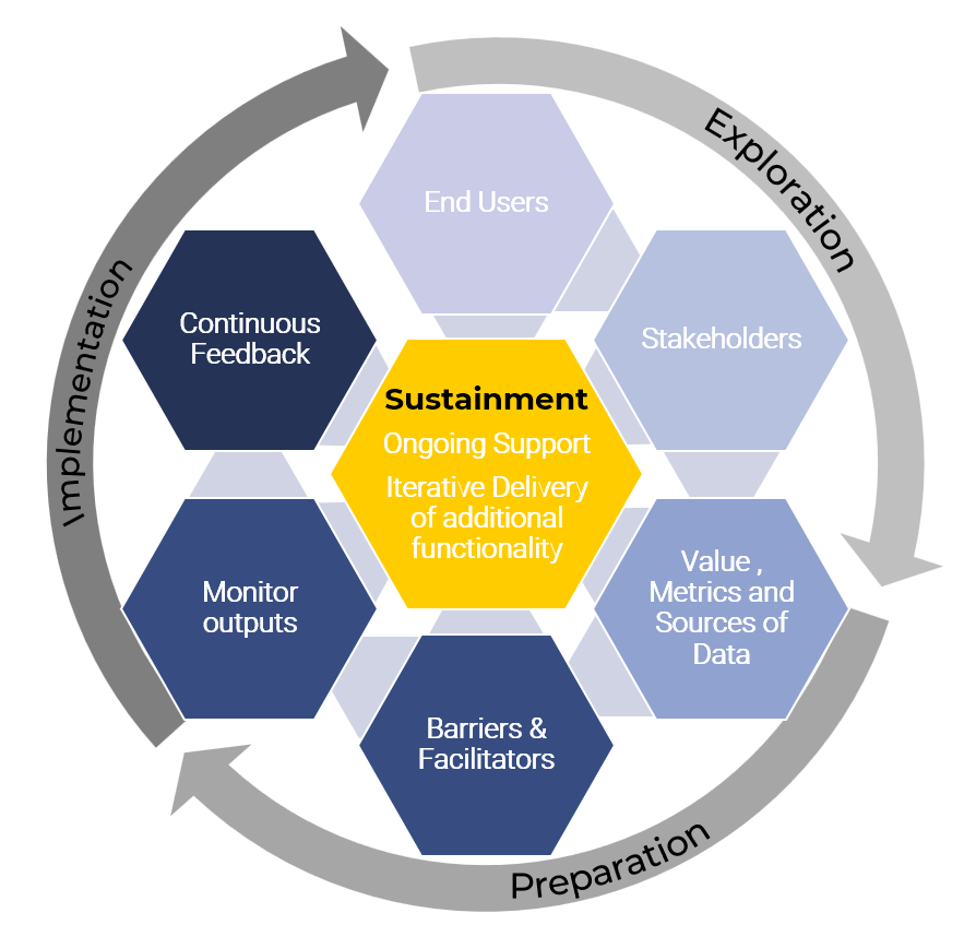
EPIS comprises of four phases that align well with the design and implementation of a dashboard through clear identification of outer systems and inner organizational contexts [2]. Even though the EPIS framework starts with exploration, it is important to consider the sustainment phase as work progresses throughout the different phases. This ensures that the dashboard is designed and developed with sustainability in mind. The EPIS framework consists of four phases: 

Exploration – this phase is informed both by user-centered design methodology and implementation science to identify the data metrics and functionality the dashboard must offer. The process begins by identifying the actors and conducting interviews to further understand their needs, and what data metrics would be most useful to them. Interviews may be guided by the Consolidated Framework for Implementation Research (CFIR), which provides a taxonomy and structure for evaluating implementation factors across multiple contexts [3][4]. CFIR consists of five domains that include intervention characteristics, outer and inner settings, characteristics of individuals and process. These domains inform the collection and assessment of user feedback and provide a framework for documenting decisions and evaluating outcomes.  

Preparation – the preparation phase considers the data metrics identified and their value, including any interoperability and dependencies among the identified metrics. Barriers and facilitators to implementation are also identified to ensure that data metrics can be implemented with the proper frameworks for coaching, audit and feedback, and that they promote effective decision-making. It is also important to consider data sources and their ease of access. Any lag or performance issues in accessing the data are also identified and addressed. 

Implementation – during implementation, the value, accuracy, interoperability and clarity of the data metrics identified are continuously monitored. Ongoing needs assessment and monitoring of barriers to implementation are also conducted. It is important to continuously seek end user feedback throughout the implementation phase on users’ understanding and interpretation of the data metrics and functionality added to the dashboard. This can be achieved through user interviews, surveys and usability testing sessions.  

Sustainment – the sustainment phase ensures the continued delivery of the dashboard, its associated data metrics, and functionality through an iterative design and evaluation process. A set of important outcomes is established based on the purpose of the dashboard and the user feedback gathered during the preparation phase. The sustainment phase provides ongoing support to ensure that the dashboard delivers the outcomes it was designed to do based on its purpose.  

Figure 1. The EPIS framework.

Applying EPIS to dashboard design 

Applying the EPIS framework to dashboard design emphasizes the application of user-centered design methodology especially during the exploration and preparation phases, while implementation science supports the implementation and sustainment phases.  

In [4] the authors highlight eight recommendations for enhancing dashboard use in the context of EPIS: 

  1. Determine data metrics and value of data accuracy – this applies to all phases and requires identifying data metrics of value to all actors. The actors identified can include end users who may interact directly with the dashboard, and other stakeholders who may not interact directly with the dashboard but may be impacted by it. It is also important to consider the sources of data used and their degree of data accuracy. 
  1. Data interpretability and clarity – applied during the preparation and implementation phases, this recommendation involves assessing potential unintended consequences and monitoring user interpretation of data to ensure accuracy.  
  1. Early and ongoing multi-level needs assessment/identification of implementation barriers and facilitators – applied during the exploration, preparation and implementation phases, this recommendation ensures that designers conduct an ongoing assessment of the needs of all relevant actors who may be exposed to the dashboard or may be impacted by it.  
  1. Design for equity – applied during the preparation and implementation phases, this recommendation addresses any potential data biases and considers the impact of the dashboard on diverse populations. Data presented on the dashboard must reflect the needs of the diverse populations that may be exposed to it.  
  1. Usable and intuitive dashboard components – during the preparation and implementation phases, it is important to ensure that dashboard components are intuitive and easy to understand when visualizing data. The dashboard must be user-friendly, intuitive, easy to understand and visually appealing without requiring the users to seeks assistance to interpret the data.  
  1. Iterative design and evaluation – the preparation, implementation and sustainment phases must incorporate an iterative dashboard design and evaluation process. This is accomplished through frequent usability testing to gather feedback from users and updating the design to address any usability gaps identified.  
  1. Consider appropriate outcomes – during the preparation, implementation and sustainment phases, it is critical that an appropriate set of outcomes is identified depending on the purpose of the dashboard. The dashboard may serve as an enabler for intervention or as the provider of the implementation strategy for intervention. An intervention dashboard is critical for delivering outcomes such that it would significantly impact the effectiveness of those outcomes if it is removed from practice. Implementation strategy dashboards provide insights that support the implementation of an intervention. They assist the user by delivering performance data to inform decisions or behaviours. 
  1. Plan for sustainment – even after the dashboard in implemented and is in use, it is important to develop a plan to ensure the sustained use of the dashboard over the long run. This involves frequent engagement of users to learn about any gaps or barriers to use and proposing solutions to those barriers. The sustainment plan should also consider the short- and long-term needs of users to ensure the dashboard continues to offer value over time.   

Conclusion 

The EPIS framework was developed to address challenges in implementing data-driven solutions in public service environments including child welfare, social services and health care. It has proven to be an effective framework for developing dashboards for any type of application, and a leading guide for the adoption of user-centred methodology and implementation science in the design and development of context-sensitive dashboards. As the framework continues to be refined and adapted to diverse research, policy and practice settings it will continue to establish itself as the foundation for the design and development of usable and sustainable dashboards.  


Designing solutions that work for users is what fuels my work. I’d love to connect and talk through your design ideas or challenges, connect with me today on LinkedIn or contact me at Mimico Design House.


References 

[1] Dashboards Drive Great User Experience 

[2] What is EPS?  

[3] Smith LR, Damschroder L, Lewis CC, Weiner B. The Consolidated Framework for Implementation Research: advancing implementation science through real-world applications, adaptations, and measurement. Implement Sci. 2015;10(Suppl 1):A11. Published 2015 Aug 20. doi:10.1186/1748-5908-10-S1-A11 

[4] Rossi FS, Adams MCB, Aarons G, McGovern MP. From glitter to gold: recommendations for effective dashboards from design through sustainment. Implement Sci. 2025;20(1):16. Published 2025 Apr 22. doi:10.1186/s13012-025-01430-x 

Dashboards Drive Great User Experience

A dashboard must enable the user to gain the information and insights they need “at a glance”, while also enabling them to better perform their tasks, and enhance their user experience overall. 

Introduction 

Whenever I drive my car, I am reminded of how its dashboard allows me to maintain control and remain aware of all the actions I need to take, while also being able to pay attention to my driving. My car’s dashboard indicates critical information to me like speed, engine oil temperature, and fuel level among other critical information. As the driver, it is essential for me to remain aware of these data points while I focus on the important task of driving, and the actions of other drivers around me.  

Like many applications, a car’s dashboard provides insight into the car’s inner workings in a user-friendly and intuitive manner, allowing the user to see and act upon information without needing to understand the technical details or the engineering behind it. This is why designing an application around a dashboard, not the other way around, makes sense in ensuring that the application’s features all cater to the data and information needs of the user.  

It is possible to architect an entire application and its features by thinking about the various components that exist on the dashboard, what information they will convey, and how the user will interact with these components. When a dashboard is designed around the user’s needs, the various components of the application must be designed such that they enable the dashboard components to receive the input they need and output the data users expect.  

In the age of AI-focused applications that require the design and development of models to support business requirements and deliver valuable insights, designing an effective dashboard focuses AI teams efforts on building models that deliver impactful output, reflected on the dashboard. 

Types of dashboards 

Dashboard can vary depending on user needs. Those needs can vary depending on whether the dashboard must enable high-level or in-depth analysis, the frequency of data updates required, and the scope of data the dashboard must track. Based on this, dashboards can be categorized into three different categories [1]: 

  • Strategic dashboards: Provide high-level metrics to support making strategic business decisions such as monitoring current business performance against benchmarks and goals. An example metric would be current sales revenue against targets and benchmarks set by the business. A strategic dashboard is mainly used by directors or high-level executives who rely on them to gain insights and make strategic business decisions.  
  • Operational dashboards: Provide real-time data and metrics to enable users to remain proactive and make operational decisions that affect business continuity. Operational dashboards must show data in a clear and easy to understand layout so that users can quickly see and act upon the information displayed. They must also provide the flexibility for users to customize notifications and alerts so that they do not miss taking any important actions. For example, airline flight operations planners may require the ability to monitor flight status and be alerted to potential delays. Some of the metrics a dashboard could show in this case are the status of gate, crew or maintenance operations. 
  • Analytical dashboards: Analytical dashboards use data to visualize and provide insight into both historical and current trends. Analytical dashboards are useful in providing business intelligence by consolidating and analyzing large datasets to produce easy to understand and actionable insights, specifically in AI applications that use machine learning models to product insights. For example, in a sales application the dashboard can provide insight into the number of leads and a breakdown of whether they were generated through phone, social media, email or a corporate website.  

Design principles and best practices 

Much like a car dashboard, an application dashboard must abstract the complexities of the data it displays to enable the user to quickly and easily gain insights and make decisions. To achieve these objectives, the following design principles and best practices should be considered.  

  • Dashboard “architecture”: It is important to think about what the dashboard must achieve based on the dashboard types describes above. Creating a dashboard with clarity, simplicity, and a clear hierarchy of data laid out for quick assessment, ensures that the information presented on the dashboard does not compete for the user’s attention. A well architected dashboard does not overwhelm the user such that they are unable to make clear decisions. It acts as a co-pilot producing all the information the user needs, when they need it.  
  • Visual elements: Choosing the correct visual elements to represent information on the dashboard ensures that the user can quickly and easily interpret the data presented. Close attention should be paid to: 
    • Using the right charts to represent information. For example, use a pie chart instead of a bar chart if there is a need to visualize data percentages. 
    • Designing tables with a minimal number of columns such that they are not overwhelming to the user, making it harder to interpret them. 
    • Paying attention to color coding ensures that charts can be easily scanned without the user straining to distinguish between the various elements the charts represent. It is also important to ensure that all colors chosen contrast properly with each other and that all text overlaid on top of the charts remains easy to read and accessible. 
    • Providing clear definitions for symbols and units ensures no ambiguity as to how to interpret the data presented on the dashboard. 
  • Customization and interactivity: Providing users with the flexibility to customize their dashboard allows them to create a layout that works best for their needs. This includes the ability to add or remove charts or tables, the ability to filter data, drill down and specify time ranges to display the data, where applicable.  
  • Real-time updates and performance: Ensuring that dashboard components and data update quickly and in real-time adds to the dashboard usability and value. This is best achieved by ensuring an efficient design to the dashboard components, such that they display only the information required unless the user decides to interact with them and perform additional filtering or customization. 

When implementing dashboards, the Exploration, Preparation, Implementation and Sustainment (EPIS) framework provides a roadmap for designers and developers to design and develop effective dashboards [2]. Combining human-centered methodology during the exploration and preparation phases of EPIS ensures that the dashboard meets users’ needs and expectations, while implementation science methods are especially important during the implementation and sustainment phases [3]. Care must be taken when implementing dashboards and EPIS provides an excellent framework that will be discussed in more detail in a subsequent article.  

Conclusion 

I always admire the design, layout, and clarity of the information presented to me on my car’s dashboard. The experience I receive when driving my car, through the clear and intuitive design of its dashboard components and instruments, makes every drive enjoyable. All the information I need is presented in real-time, laid out clearly and placed such that it allows me to focus on the task of driving while also paying attention to how my car is behaving. I can adjust, tune and customize the dashboard components in a way that further enhances my driving experience and adds to my sense of control of the car. 

The properties of a car dashboard reflect exactly how an application dashboard must behave. While the user of an application may be using the dashboard under a different context than driving a car, the principles of user experience, interaction design and overall usability still apply. A dashboard must enable the user to gain the information and insights they need “at a glance”, while also enabling them to better perform their tasks, and enhance their user experience overall.  


Designing solutions that work for users is what fuels my work. I’d love to connect and talk through your design ideas or challenges, connect with me today LinkedIn or contact me on Mimico Design House.

References 

[1] Dashboard Types Guide: Strategic, Operational, Tactical + More 

[2] Aarons GA, Hurlburt M, Horwitz SM. Advancing a conceptual model of evidence-based practice implementation in public service sectors. Adm Policy Ment Health. 2011;38(1):4–23. 

[3] From glitter to gold: recommendations for effective dashboards from design through sustainment