Introduction
My experience designing dashboards for various applications, including finance, investment, and mission-critical operations, has shown me how important it is to understand users’ mental models for hybrid workflows when developing advanced dashboard solutions.
Lately, I’ve been working on dashboards tailored for hybrid quantum-classical environments. These dashboards don’t just display data; they also map timelines across different metrics and system health indicators, enabling users to identify patterns quickly, reduce diagnostic time, and make quantum operations more accessible beyond the core community of physicists.
To illustrate these ideas further, I’ll take an in-depth look at a sample dashboard for a hybrid classical-quantum system, highlighting its key features and functionalities. This example demonstrates how hybrid dashboards are designed to address the unique requirements of these complex environments.
Hybrid Quantum-Classical Dashboard: Critical for Error Diagnosis
Hybrid quantum-classical processes combine quantum processors with classical high-performance computing (HPC) systems. These architectures facilitate coordinated orchestration, scheduling, and monitoring of QPUs alongside GPUs and CPUs, thereby enabling efficient operation of hybrid workloads. The dashboard example highlighted in this article demonstrates how such integrations are visualized and managed, granting users real-time insights and centralized controls for both quantum and classical resources.
The distributed configuration of hybrid systems often disperses user context across numerous dashboards and applications. Operators may frequently transition between QPU vendor platforms, HPC dashboards, and even handwritten notes. This continual switching increases the likelihood of losing track of individual runs and complicates error diagnosis at the gate level. The dashboard presented seeks to address these challenges by consolidating essential information and providing a unified interface for monitoring and troubleshooting.
Users of hybrid quantum-classical environments require dashboards that deliver:
Transparent device and job statistics, including qubit coherence times, calibration drift, and job fidelity, as well as comprehensive job details, such as IDs, status, parameters, execution times, results, and error logs. The dashboard described in this article presents these statistics in an accessible manner for both quantum and classical jobs.
Resource-focused health metrics, which offer alerts for QPU performance degradation and metadata vital for debugging and workflow optimization. The dashboard integrates these notifications and health indicators to enhance proactive system management.
Telemetry for each job and qubit, supporting advanced analysis of reliability, detection of calibration boundary effects, and improved workload scheduling. The dashboard illustrates effective visualization of telemetry data for workflow enhancement.
These requirements closely align with the mental models adopted by quantum teams, who are primarily concerned with system health, job-specific issues, and recent changes in calibration. Ultimately, these mental models converge around three perspectives: job-centric, resource-centric, and workflow-centric approaches. The dashboard deep dive showcases how these perspectives are incorporated into the dashboard’s design, ensuring that users’ key questions and operational needs are addressed efficiently and intuitively.
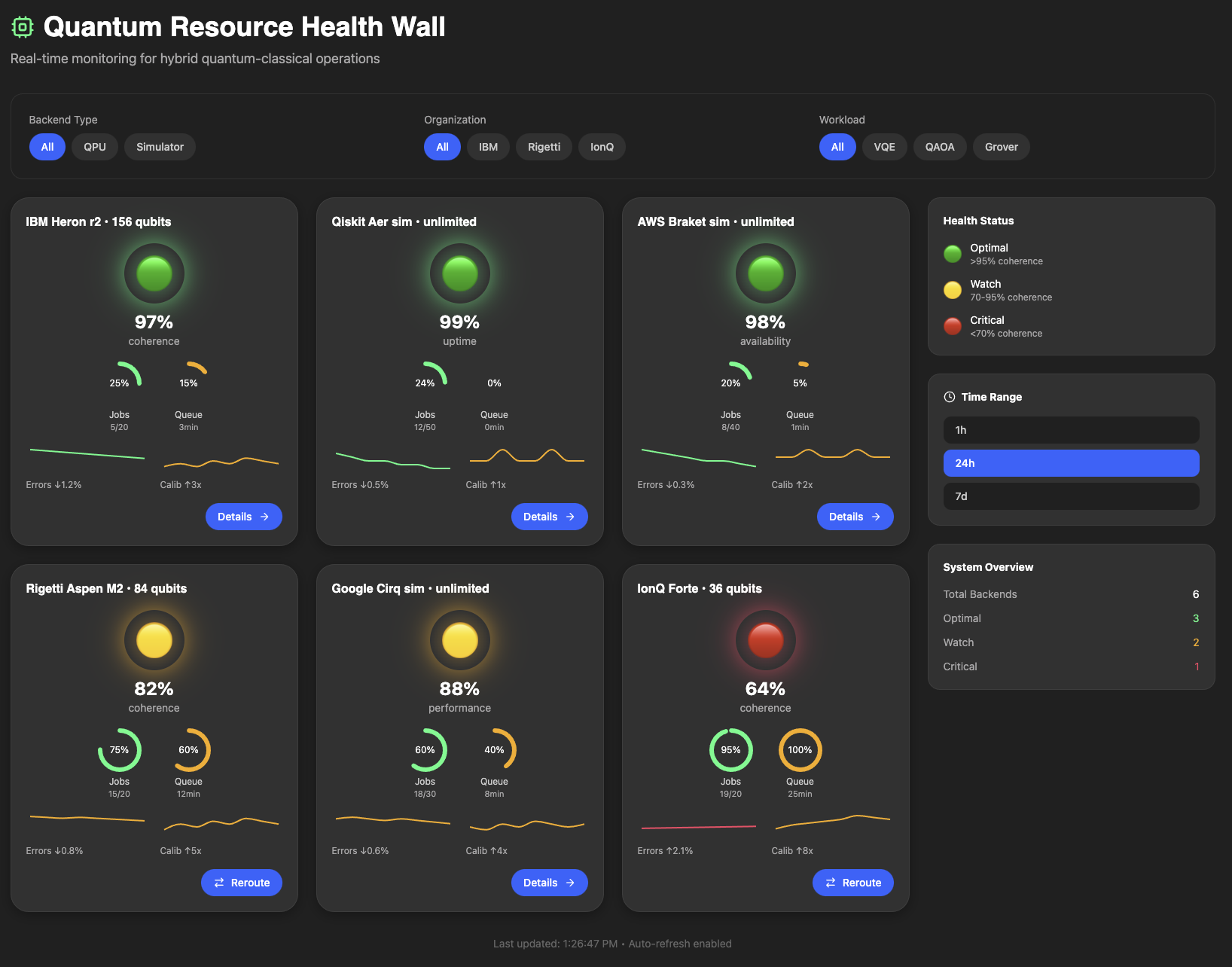
The Quantum Resource Health Wall
The Quantum Resource Health Wall serves as an integrated dashboard designed for hybrid quantum-classical operations, consolidating backend health, job telemetry, and operational context into a single, coherent interface. This system eliminates the need for operators to navigate multiple consoles, logs, or execution pages by presenting critical information, including qubit coherence, calibration drift, queue depth, per-job fidelity, and backend status, in a tiled format that facilitates efficient scanning.
When backend intervention is required, the interface delivers performance alerts and diagnostic metadata, enabling teams to assess changes, identify causes, and determine appropriate responses. For comprehensive analysis, each tile is expandable to display detailed data such as job IDs, parameters, execution times, results, error logs, and qubit-level telemetry, thereby supporting both streamlined oversight and in-depth workflow optimization.

The main dashboard provides the following features:
Resource Tiles
Sorted by health status, each tile displays the backend name, qubit count, health status with glowing traffic lights, capacity gauges for jobs and queue time, trend lines for error rates and calibration activity, and action buttons.
The health status color scheme using green, yellow and red allows the user to immediately determine the status of each backend. The coherence percentage is also displayed immediately below the health status. These two pieces of information combined serve as an immediate visual indicator to the user as to the status of the system.
The jobs and queue gauges give users a fast, operations-focused snapshot of backend load. The jobs gauge shows how many active or pending jobs are currently assigned to a QPU or simulator, often expressed as a count or percentage of available capacity, so users can quickly see whether a backend is lightly used or approaching its limit. The queue gauge complements that view by showing how much backlog exists before a job can begin execution, which helps distinguish a healthy backend with a few running jobs from one that is congested and likely to create delays. Together, these two gauges make it easy to understand both current utilization and current wait conditions at a glance.
The error trendline shows how backend error rates evolve over time, while the calibration trendline shows when and how often the system is being recalibrated. Recalibration is performed when a quantum device drifts from its ideal settings, once drift or degradation are detected. Viewed together, the errors and calibration trendlines help operators distinguish between normal noise, emerging drift, and the performance changes that follow calibration events.
Users can see each tile’s metrics by hovering over it, which also indicates the tile is clickable for more information.

Filter Bar
Top filter section with segmented pills for Backend Type, Organization, and Workload. This enables the user to focus the dashboard view by selecting the each of the filter criteria, in case any of the backend systems require taking a closer look.
Legend Sidebar
The right sidebar contains the health status legend. Green indicates an optimal health status with more than 95% coherence. Yellow indicates that the backend may be losing coherence, with coherence levels in the range 70-95% and thus requiring a watch status. Red indicates a critical status with coherence less than 70% and may require immediate action.
The time range selector (1h/24h/7d) allows the user to see a snapshot of the wall based on the selected time range. The system overview stats provide totals for the backend and status types.
Backend Details View
Clicking a tile on the health wall opens a detail panel that turns a high-level health signal into a complete operational story for that backend. Inside the details panel, the user can see four things at once: key performance KPIs (such as coherence, error rates, active jobs, and typical runtimes), time-based charts showing how those errors and calibrations have evolved, a view into the current workload, and recent calibration activity. The detail panel is the place where the user moves from observing a red or yellow tile on the dashboard, to understanding exactly what went wrong, when it started, and which jobs are affected.

KPI Cards
The KPIs summarize current state such as Coherence %, Readout Error %, Active Jobs, and T1/T2 Time with trend indicators and color-coded icons.

Error Rate Timeline
Interactive line graph showing readout and gate errors over the last hour with calibration event markers.

Job Distribution Donut
Pie chart visualizing active workload by algorithm type (VQE, QAOA, Grover, QPE, Other).

Qubit Health Map
Dynamic grid showing per-qubit status for QPUs only, with health statistics.

Active Jobs Table
A jobs section exposes what is running or queued on that backend—job IDs, algorithms, shots, status, runtime, and error rates —so operators can connect backend health to concrete workloads.

Calibration Log
Timestamped events with severity-based icons (success, warning, error, info).

Reroute Alert Bar
Auto-shown on critical (red) backends with one-click reroute action button to allow the user to reroute jobs from critical to healthy qubits.

Conclusion
In summary, this article presents a comprehensive overview of quantum backend monitoring tools, highlighting the importance of tools to visualize job distribution, qubit health maps, and active jobs tables. These features enable operators to track workloads, assess system health, and respond to critical backend issues efficiently.
By integrating real-time calibration logs and reroute alert, the system ensures that quantum computing resources remain reliable and accessible, supporting informed decision-making and optimal performance within the quantum infrastructure.
Baha Jabarin is Founder of Mimico Design House, where he leads human-centered product design that transforms complex digital experiences into intuitive, impactful solutions. Drawing from his portfolio of enterprise projects, Baha blends empathy-driven research, data insights, and strategic prototyping to empower organizations and their users.
His methodology simplifies workflows while maximizing engagement, as showcased across bahajabarin.com through case studies, design processes, and thought leadership content. Active on LinkedIn, YouTube, and podcasts, Baha shares practical strategies for product innovation that deliver measurable results.


